
It was a post on the Penn State University Libraries’ Instagram account that started me on a journey of sharing one of my quilted data visualizations:

I was curious to learn more, and I jumped online to explore the Love Data Week website. I didn’t realize that Love Data Week an annual international celebration of data that began in 2016. Each year, during the week of Valentine’s Day, universities, nonprofit organizations, government agencies, corporations and individuals are encouraged to host and participate in data-related events and activities. Each year has a different theme.
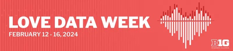
The 2024 theme is “My Kind of Data.” Data is personal. Join International Love Data Week February 12-16, 2024, to learn about data equity and inclusion, disciplinary communities, and creating a kinder world through data. – from Love Data Week website
The Big 10 Academic Alliance, of which Penn State University is a part of, collaborated to host a series of webinars and events across the institutions – and, a competition! First, each university held an internal competition to determine a faculty/staff winner and a student winner. All students, no matter which university they are attending, were required to use the LEGO Brick data source as the basis of their visualization. Then, the institutional winners were posted online and a voting period began to determine the overall champion for students and faculty/staff.
At first, I wasn’t going to submit anything. When I hear “data visualization”, I think of something that is similar to an infographic – perhaps something colorful, something on a website that is a rich resource for communication and the basis of decisions to be made. But then, I have a few data visualization quilts, and I thought – why not submit one? I’m always looking for ways to share science stories, so even if I didn’t win, I could hope a few more people would learn about earth science! I decided to go with my Blue Skies and Cloud Cover quilt.
The first round decision was done internally through Penn State Libraries – and I was notified that I was selected to represented the faculty/staff category with my quilt. I couldn’t believe it! I’m sure no one expected a quilt to be submitted as a data viz, but I was thrilled to have the quilt go to the national level and represent Penn State.
Next up – the voting. All of the finalists from each institution had a photo and description of their data viz posted online. This part made me cringe – I hate popularity contests, and knowing that I’m at a smaller Penn State campus, I knew there was no way I would be able to get enough votes at Penn State to rise to the top (voting was restricted to only people at Big 10 schools). But I went ahead and emailed not just my colleagues at Penn State Brandywine but my colleagues at the Penn State University Park (main) campus. I even had my students vote for me!
The voting ended, and Love Data Week arrived. Penn State held numerous events. And then, on Friday afternoon, the BTAA Data Visualization Champion would be announced during a showcase with all finalists having the opportunity to share in Zoom their visualizations. It was a really wonderful event to hear from the students and faculty/staff on the background of their data visualizations and to see some of them as interactives.
I will admit I was a little uncomfortable, as everyone showcased incredible computer/digital graphics, and when my turn came round, I just pointed to the quilt hanging on the wall behind me. But my insecurity quickly went away when comments started appearing in the chat:
- BEAUTIFUL quilt!
- A gorgeous quilt – I love quilts
- I love your data uqilt!
- The creativity on this Zoom is amazing!
- Awesome, amazing and beautiful!
- The quilt is lovely and the story is amazing! I love art with data… or is it data with art!?
At the end of our Zoom time, the winners were announced – the student winner was Elsie Lee-Robbins, PhD Student in the School of Information – University of Michigan. Elise plotted the top LEGO themes by the number of sets developed for each theme over time. Then the faculty/staff winner was announced – it was me and my quilt!

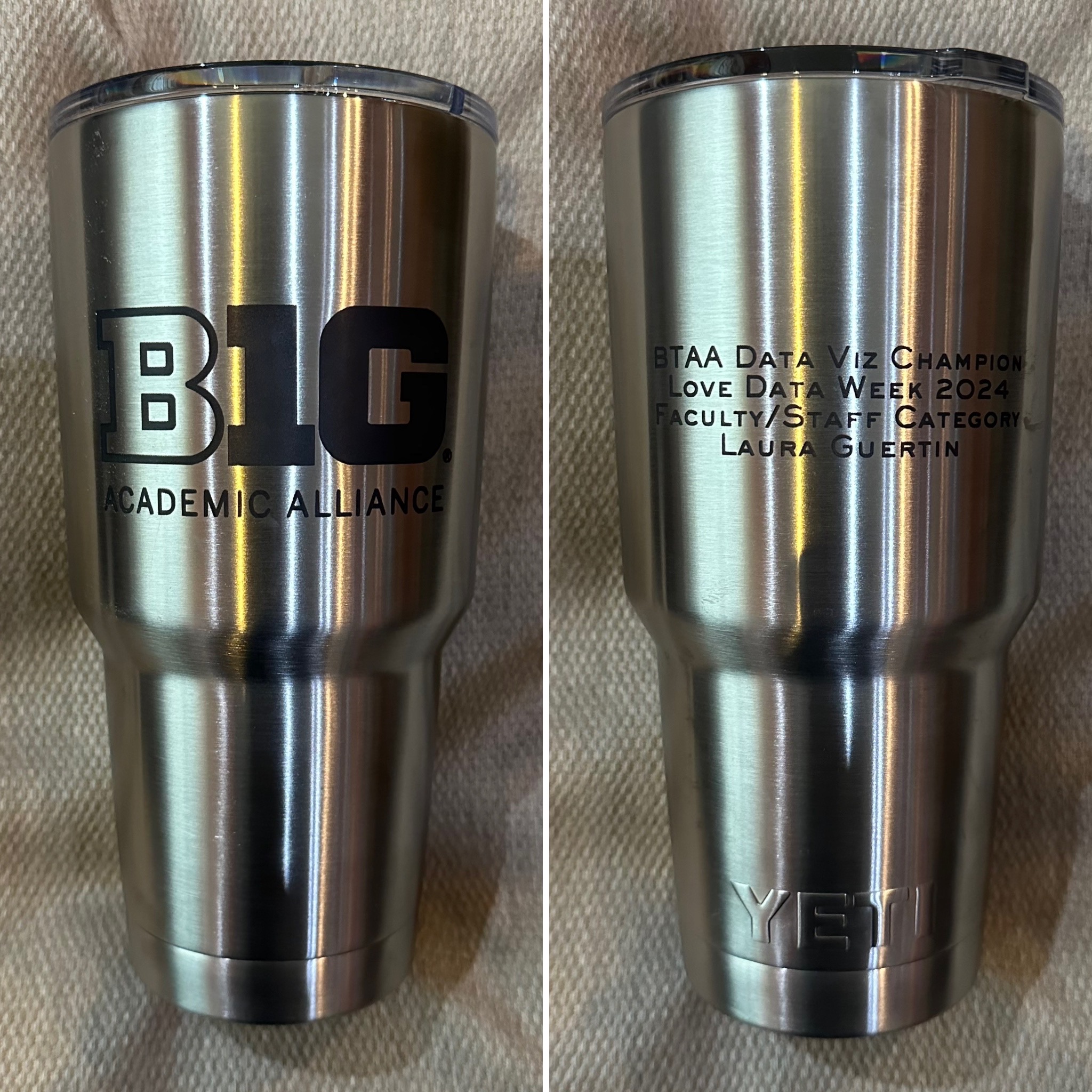
Words can’t describe how surprised and thrilled I was to hear that a quilt won a data visualization competition! It still brings a smile to my face! I just received my award of an engraved YETI tumbler in the mail (which is why this post is coming months after the competition concluded).
So, what’s next for me? Will I still make quilts containing data? Absolutely! I’ll definitely continue to expand upon my data visualization collection. But I’m also thinking about ways that perhaps I could involve my students – maybe not in the national competition, but through some sort of competition on campus, perhaps using additional earth science or oceanographic data. Hmmm….
Thank you Big 10 Academic Alliance for hosting Love Data Week! I look forward to the theme and activities in 2025.

[…] I entered this quilt into a competition – and won! Read more about how a quilt won Love Data Week 2024. […]
LikeLike
[…] I was invited to speak at the University of Nebraska’s Data Storytelling Workshop & Data Art Jam to share how I have incorporated data into my quilts. This was an opportunity to showcase some of the quilts I created from my time at sea on JOIDES Resolution (Taking the Temperature and What Goes Up, Must Come Down), including my BTAA award-winning Blue Skies and Cloud Cover JR quilt from Love Data Week 2024! […]
LikeLike