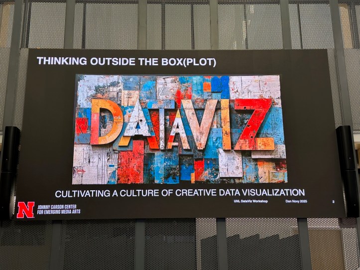
I started 2025 with an invitation to present at one of the most unique events in my career, the Data Storytelling Workshop & Data Art Jam, hosted by The Johnny Carson Center for Emerging Media Arts at the University of Nebraska–Lincoln. This one-day event, held on January 13, was a combination of a panel of speakers each talking about their own work in the area of visualizing data, and time for hands-on generation of data physicalization by participants.
There’s an excellent summary of the event captured by one of my fellow panelists, Rahul Bhargava (see Nebraska Data Art Jam: Beyond Visualization), complete with images. You can also find online the Data Sets tapped by those in attendance.
I was excited to bring along and discuss a few of my data visualization quilts I generated from my time at sea on JOIDES Resolution – Blue Skies and Cloud Cover, Taking the Temperature, and What Goes Up, Must Come Down. And I also made a special quilt for this event, challenging everyone to guess what my quilted dataviz represented. Here’s a description of the quilt and a video I generated about it.
As much as I contributed to this event, I believe I took even more away from it. What are some of the specific items I’m going to be reflecting upon for some time?
- The “rigidity” of data visualizations – does this make them look more accurate? What if a dataviz is changeable?
- By increasing our dataviz toolbox, we can generate a multi-sensory experience by including painting, smells, sound, blowing air, etc. This can lead to having data be “felt”.
- The generation of data visualizations can involve community in the design, construction, and as part of a facilitated dialog.
Of course, what is a meeting such as this without a discussion of, what is data? What counts as data? Lots to think about!
And there are lots of examples I want to check out – the empty chair COVID-19 memorial, a data mini-golf course by the Los Angeles Poverty Department, data drums climate sonification, the Dear Data project, and Kenneth Goldsmith reading traffic reports.
I have ideas on how to do more with data visualizations in my existing classes – and who knows – maybe, someday, I’ll teach the Penn State course SC 103N: When Data Meets Design. I would love to do some of the activities with students that we did in Nebraska, such as building a data sculpture (we did this with ice cream consumption data!).
